
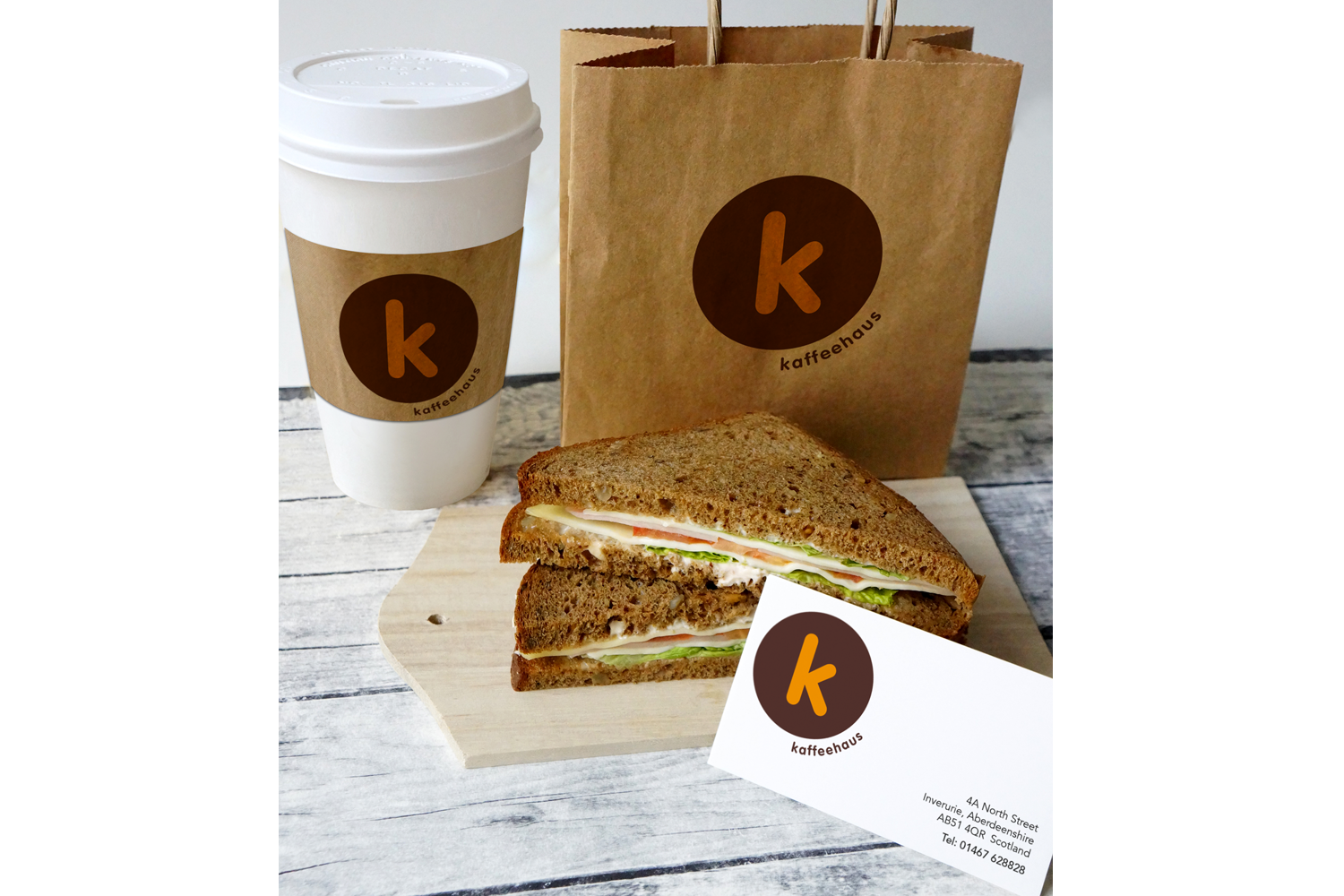

Kaffeehaus, a community café in the United Kingdom, required a flexible brand identity that could be adapted across its range of products.
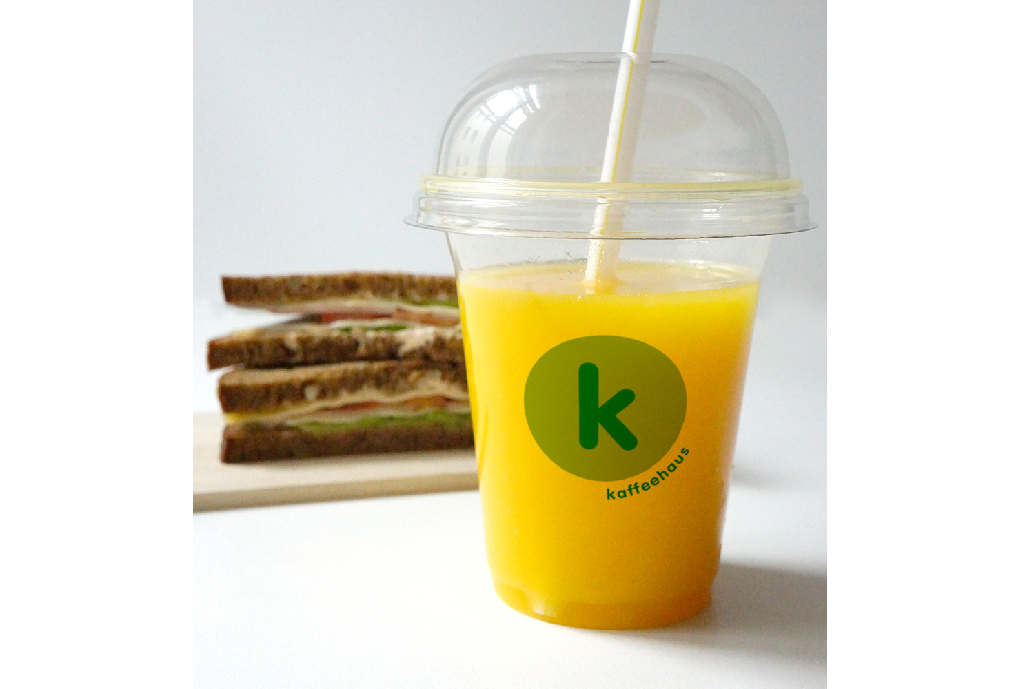
The design approach focused on simplicity and warmth, using a rounded typeface and a minimal colour palette. A green variation of the identity was later introduced to highlight organic produce, allowing the brand to differentiate product ranges while maintaining a consistent visual identity.