
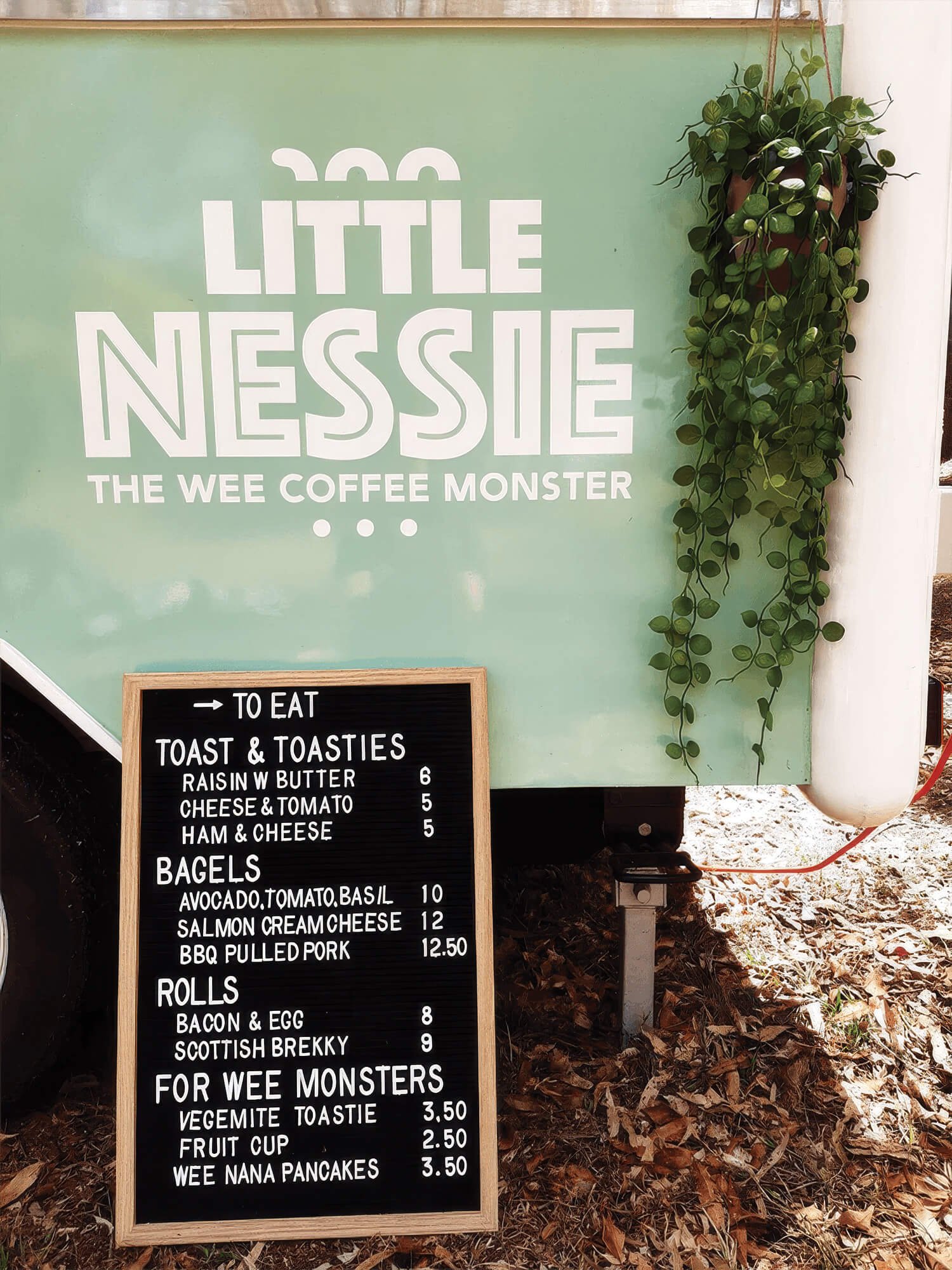

Little Nessie began as a personal project for a former colleague who wanted to bring a family dream to life, a coffee business serving her local Brisbane community. With her partner's Scottish roots as the creative spark, they named the business Little Nessie, with the tagline: The Coffee Monster.
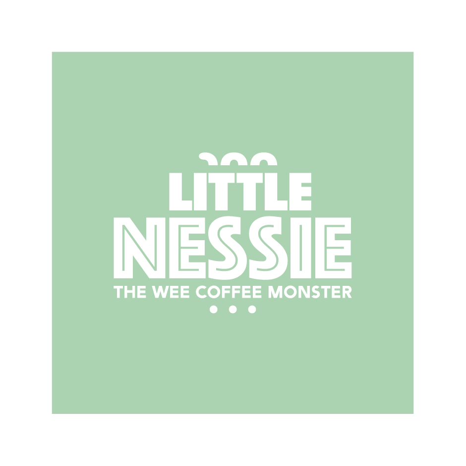
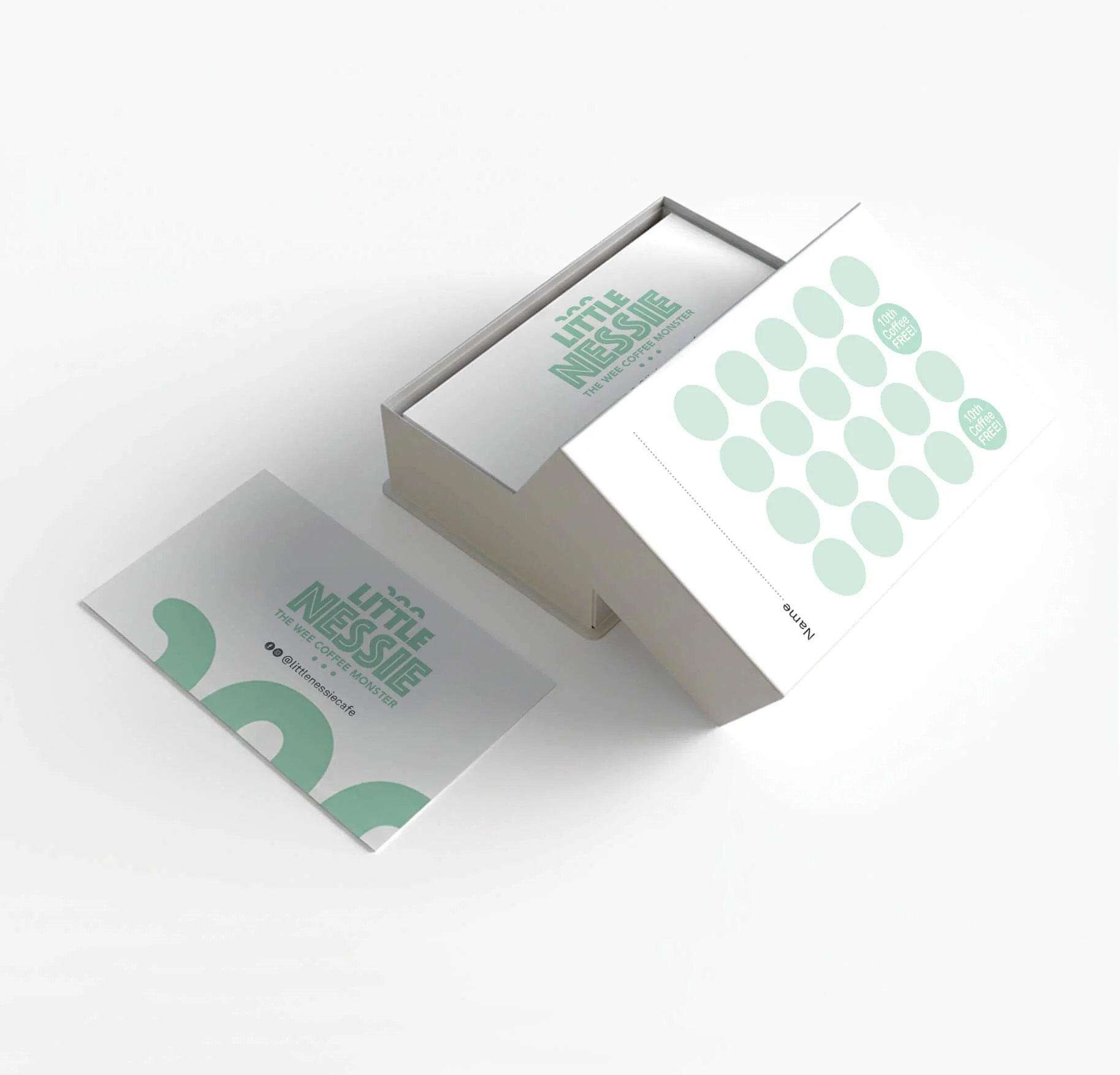
The brief called for a brand identity that set it apart from competitors and gave it a genuine personality. I selected a bold, chunky typeface that embodied the weight and character of the monster itself, then incorporated Nessie as a standalone icon, giving the brand a mark flexible enough to work independently across all touch points.
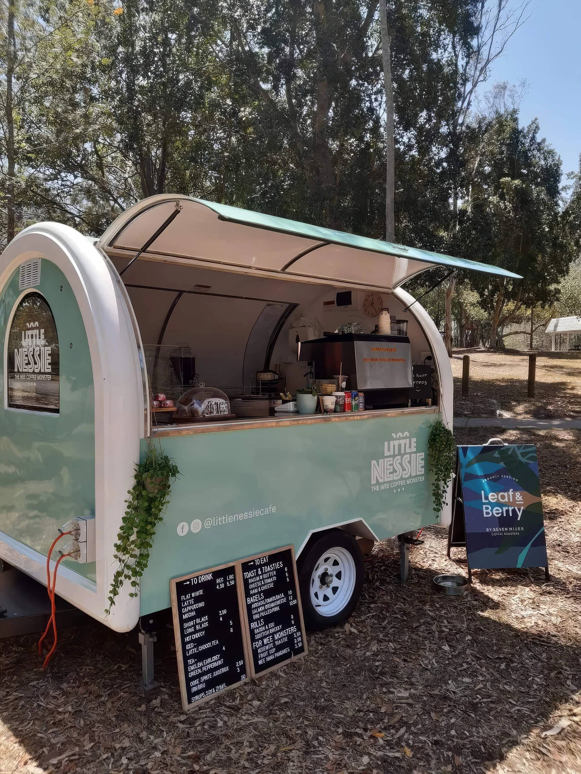
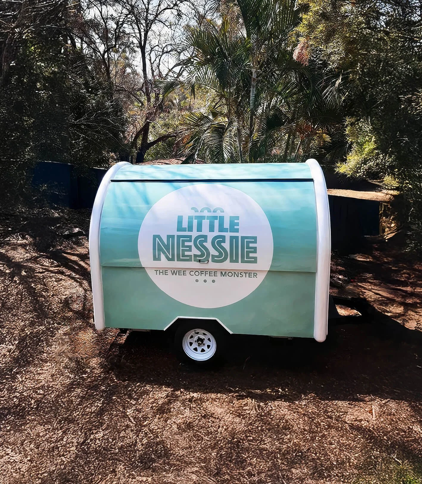
The van artwork presented its own challenges. The design needed to advertise the business while in transit and closed, but also come alive in location with the serving window open - two very different contexts demanding the creative work across both. My expertise in print production was central to getting the execution right.
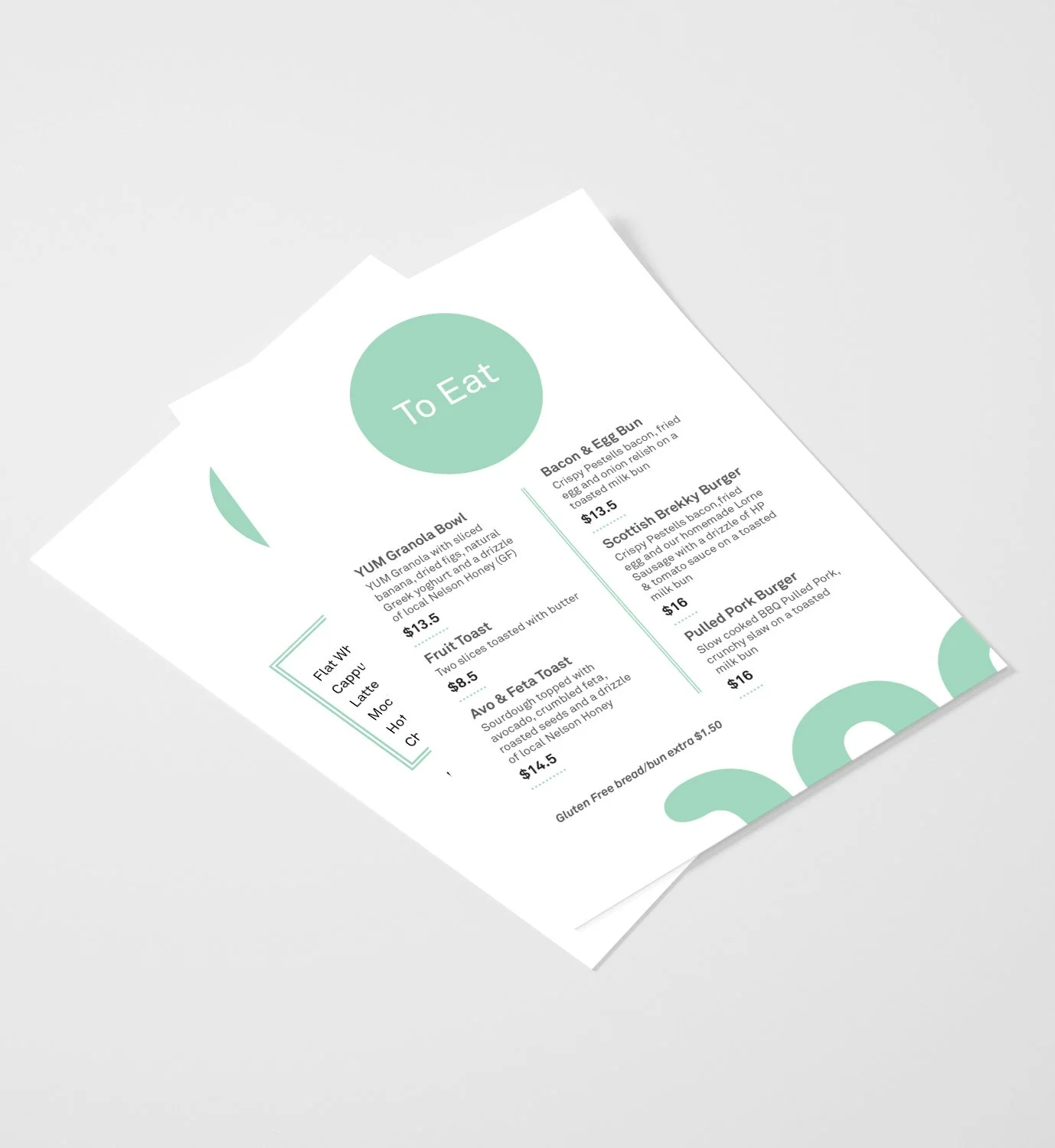
The brand proved strong enough to travel. When the business was sold and the couple relocated to New Zealand to open a permanent site, I was brought back to develop the menus and supporting collateral, helping evolve the identity into its next chapter.