

Not every brand requires a full identity system. The projects featured here represent focused identity commissions for start-ups across the UK and New Zealand, each shaped by a different sector, audience and commercial objective.
What connects them is the same strategic starting point: understanding what each business stood for before determining how it should look. Whether the brief called for bold, playful colour or refined clinical precision, the outcome was always grounded in clarity, intention and strong visual thinking.
The result is a collection of clean, considered identities with distinct points of view and purposeful use of colour.
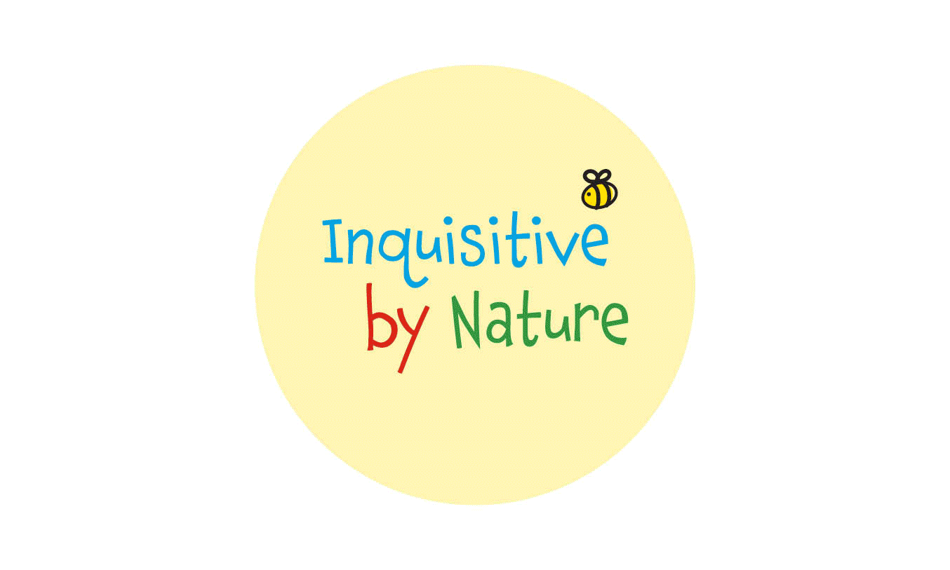
Inquisitive by Nature is a New Zealand start-up selling natural, sustainable products for babies and young children, spanning clothing, toys, sleep accessories and early childhood resources.
The founder came with a clear set of values - natural, fun, imaginative, sustainable and a vision for the direction. Rather than interpreting the brief literally, I developed four distinct identity directions exploring the full range of the brand's personality, from playful and child-led to refined and parent-facing.
The core creative challenge was a brand that needed to appeal to children while resonating with the parents making the purchasing decisions. The chosen identity balanced both - playful enough to connect with the world of childhood, considered enough to build trust with parents who care about what they're buying.
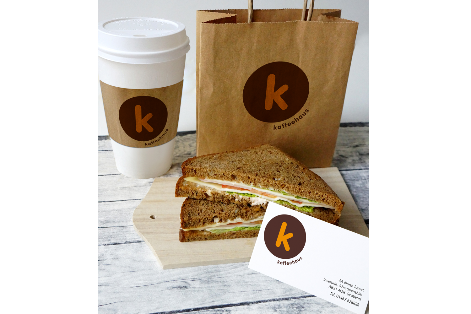
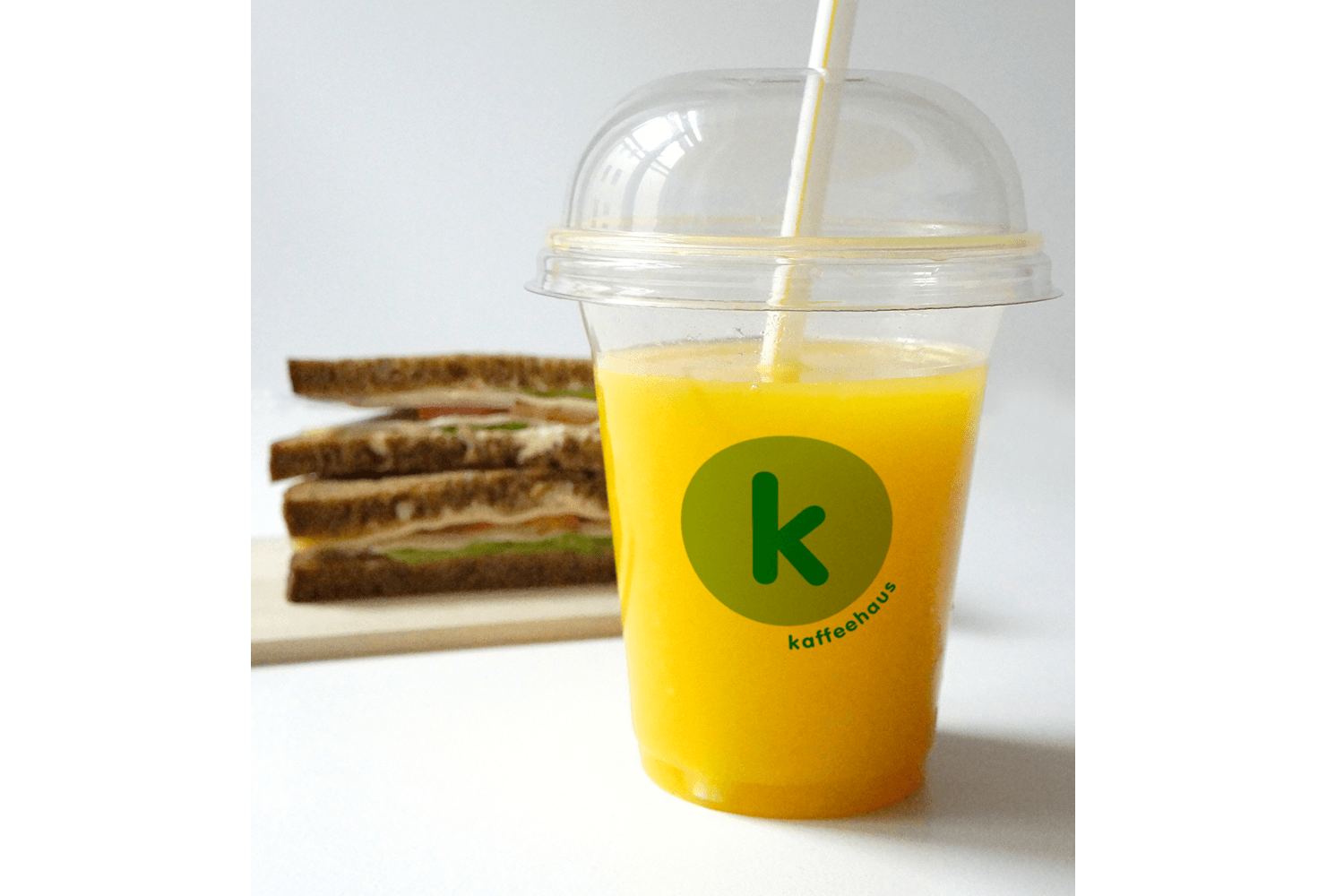
Kaffeehaus is a community café built around organic, locally sourced food and honest, unpretentious hospitality.
The name became the creative foundation. Kaffeehaus (the German word for coffee house) - pointed directly toward a design philosophy: Bauhaus. The identity was built on reducing form to its essentials. A circular container, a single lowercase k, clean rounded strokes and minimal colour. No decoration, no excess. Just clarity and function.
Brown tones reference coffee while grounding the brand in its natural values. A green variation was introduced to differentiate the organic range without breaking the core identity.
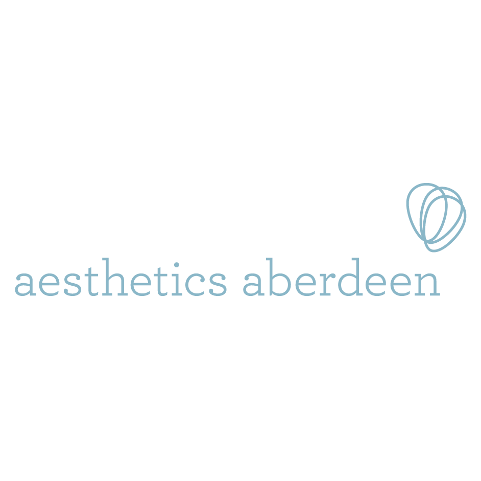
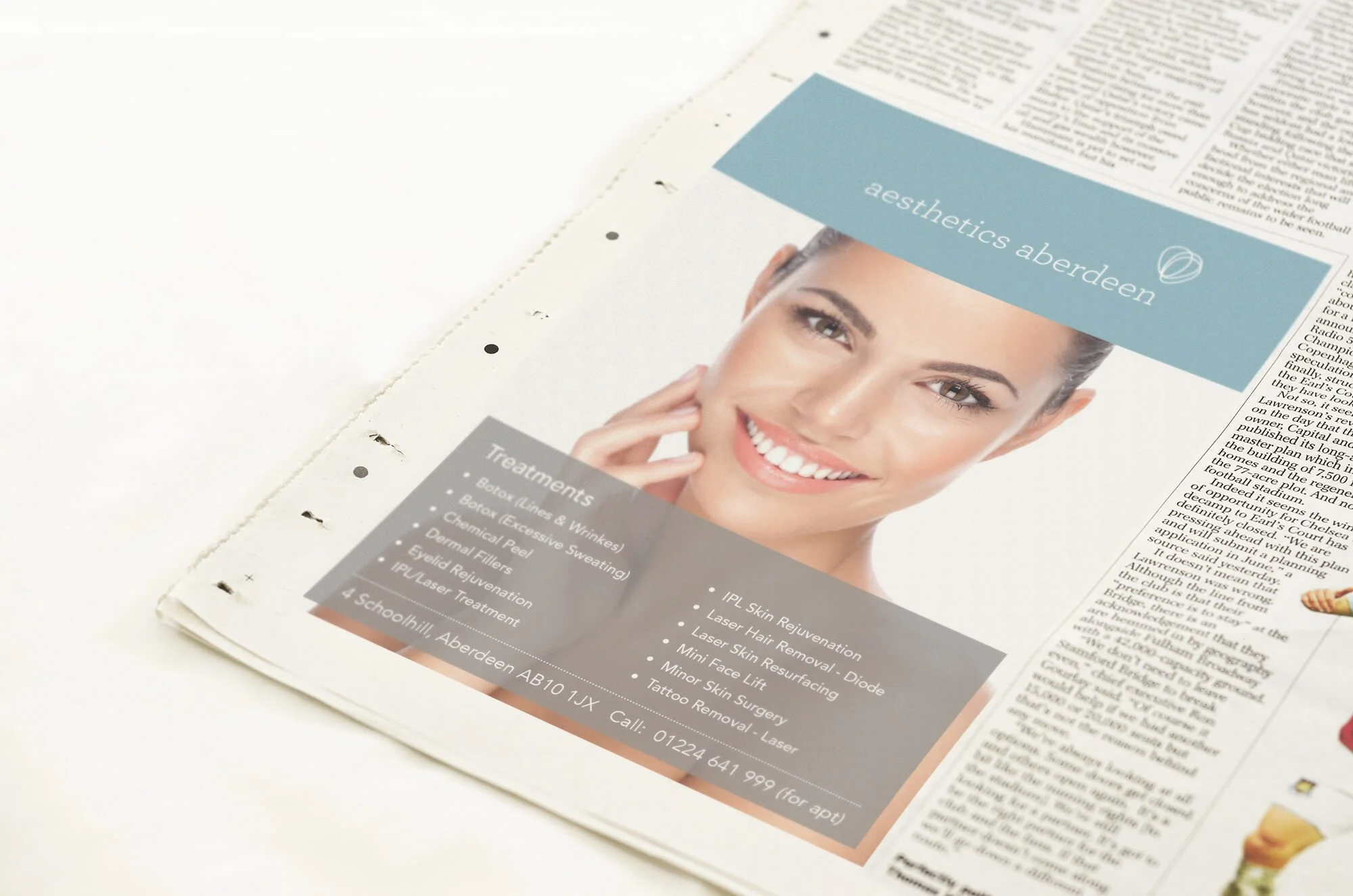
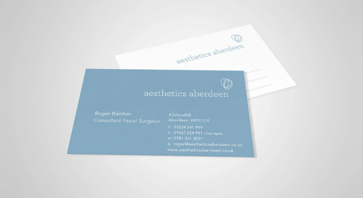
Aesthetics Aberdeen is an Aberdeen-based cosmetic treatment clinic whose core market is women seeking premium aesthetic procedures.
The identity needed to feel expensive, clinical and feminine simultaneously. The font was selected for its elegant curves and feminine character. The icon, developed from flower petals, adds softness while remaining refined enough for a medical context. Pale blue was chosen to convey both trust and clinical cleanliness, the colour language of the medical profession.