

IKEA operates within one of the most rigorously governed brand environments in global retail. Every piece of customer-facing communication sits within a strict global compliance framework, leaving very little room for deviation. Because so much of the work at this level involves governing and executing within a global framework rather than being creative, this section focuses on the two pieces of work that best represent my own thinking within that environment.
Day-to-day the role centred on brand stewardship at scale - managing the customer communication journey across the entire store, planning promotional message placement, overseeing print production and installing large-format vinyl, all while ensuring every touchpoint met global brand standards. During my time there the store underwent a formal compliance inspection. We passed.
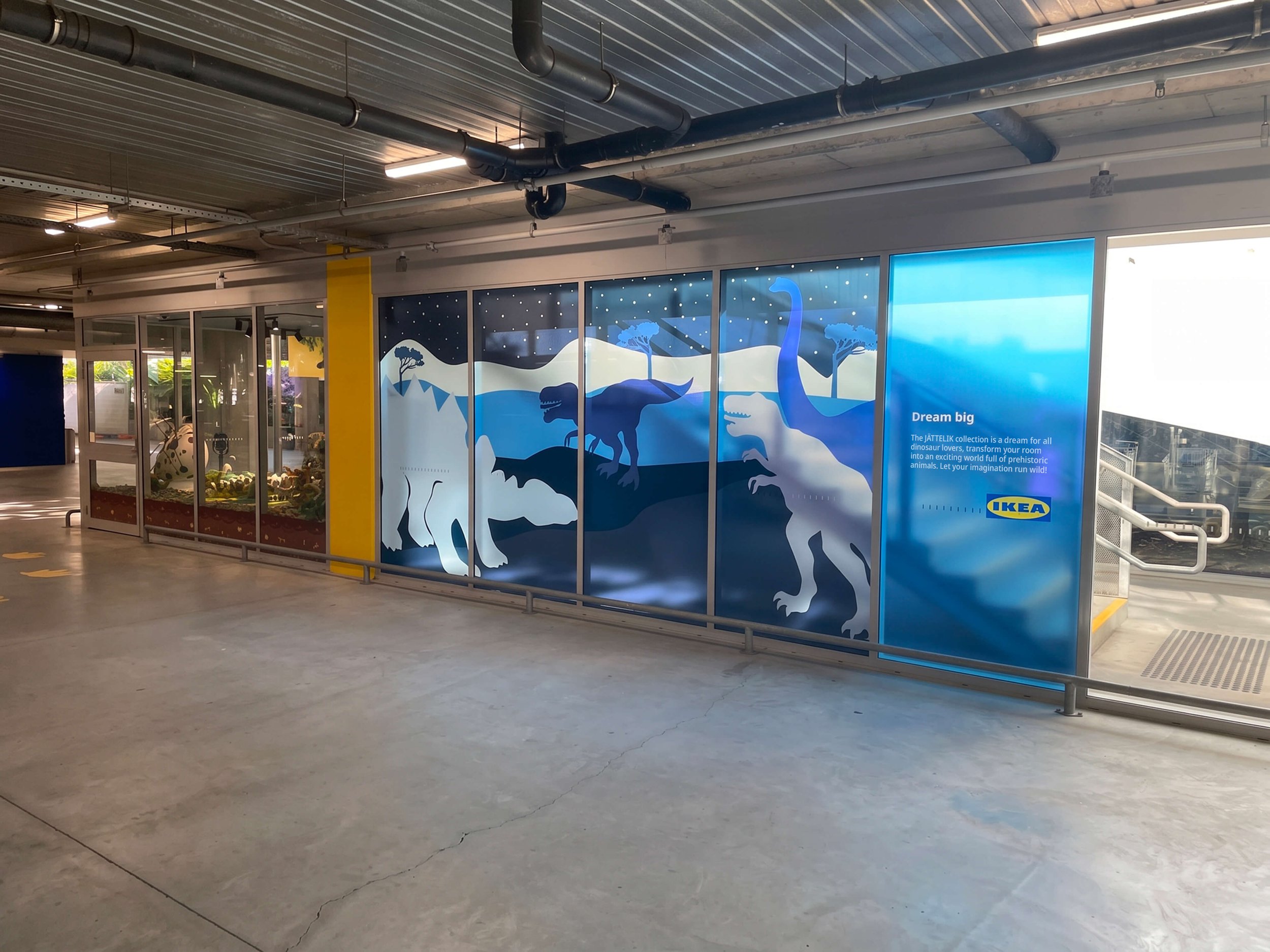
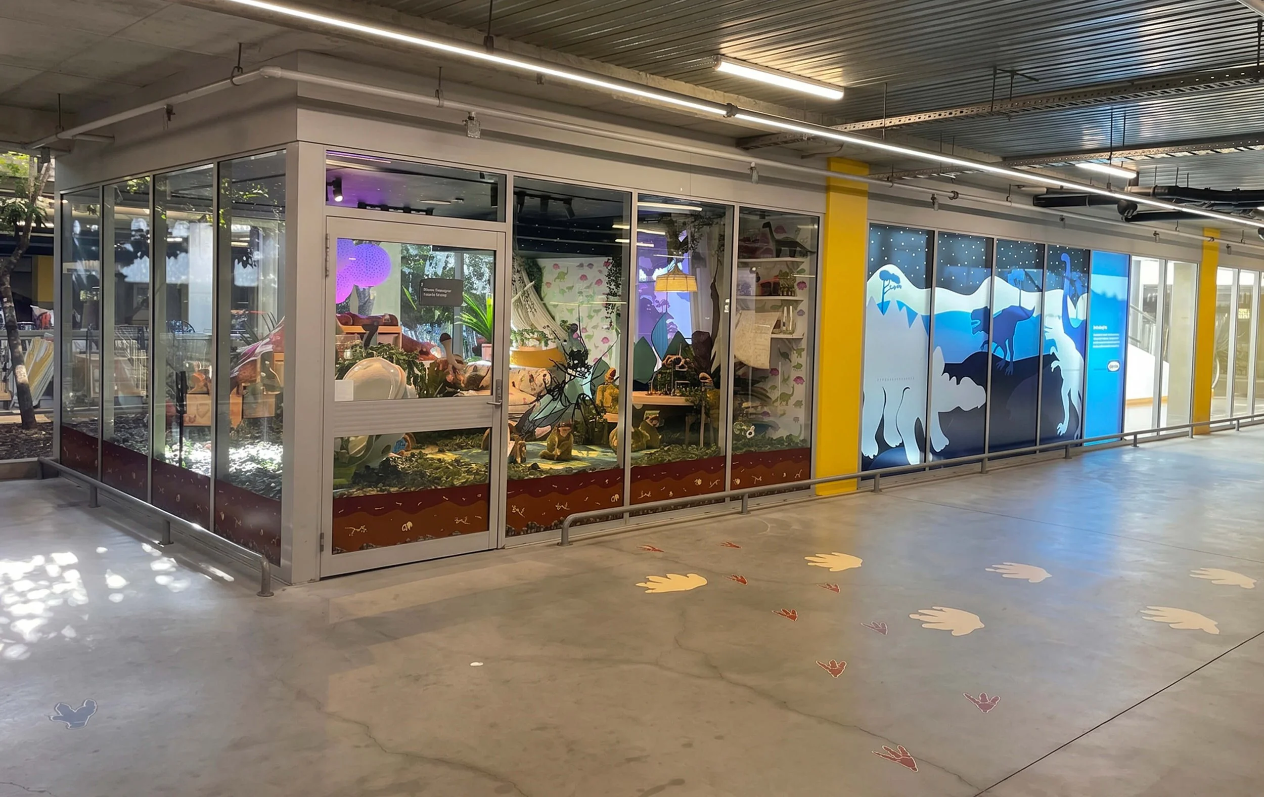
Working alongside the Visual Merchandising team, this window concept was designed around the idea of a child dreaming about dinosaurs coming to life in their bedroom while they slept. The hero of the space was the IKEA children’s dinosaur range, including bedding, soft toys and accessories.
I took patterns from the existing bedding and curtain designs and redrew them to work as large-scale graphic installations at the store entrance. Dinosaur footprints were placed strategically from the store entrance leading customers towards the activation, alongside a dinosaur viewing platform inviting children to “count the dinosaurs”.
I also created a custom wallpaper pattern backdrop and a layered fossil graphic for the display to sit above, helping transform the window into a playful storytelling environment while still keeping the product range at the centre of the display.
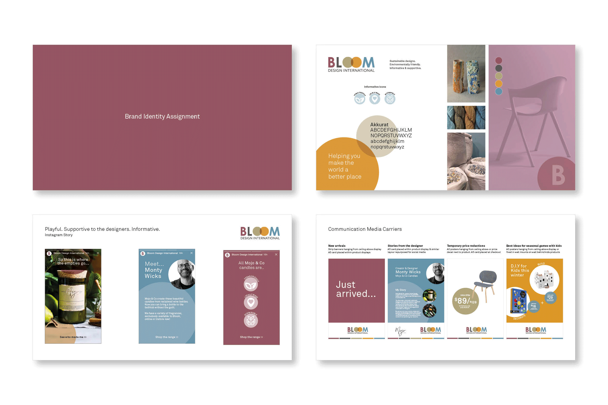
This was a second assessment in the recruitment process for IKEA that required me to interpret a fictional brand - Bloom Design International, a sustainable home furnishing company. I had to figure out how to answer the two distinct briefs with no templates, no precedent and no guidance beyond the brand description itself.
The first brief required a full brand identity. I developed a moodboard, defined the visual language, selected a typeface, built a colour palette and created a suite of informative icons to communicate the brand's sustainability values; vegan friendly, locally made and sustainable. I then applied the identity to a series of Instagram Stories that brought a real product, a candle brand called Mojo & Co, to life within the Bloom world - showing how the brand could tell a designer's story in a way that was playful, informative and on brand simultaneously.
The second brief shifted from identity into retail communication strategy. Given a store layout with a 4000mm ceiling height, I was required to plan where and how four distinct messages; new arrivals, stories from the designer, temporary price reductions and seasonal ideas for kids would be communicated across the store environment without creating visual conflict. I mapped the placement of every communication carrier across the floor plan, developed the creative for each message type and visualised the full store window from the street.